Illustration Blog
Monday, 1 June 2015
Tuesday, 23 April 2013
Realism Issue - Graphic Novel & Storyboard
Assignment 04 - Realism (04-22)
Biopic - The Michael Jackson History Tour
Storyboard Plan - 01
Storyboard Plan - 02
Storyboard - Lines
Storyboard - Final
Monday, 25 March 2013
Surrealism Issue - Splenda Ad & Storyboard
Assignment 03 - Surrealism (03-25)

Product - Splenda
Splenda is the healthier, low-calorie
presence of the product mascot.
Mascot
Concept Art
Mascot: Amelia
Character Summary: Amelia is a young, playful child who loves everything and anything sweet and good. She wants to pass on the sweetness to everybody around her.
Product - Splenda
Splenda is the healthier, low-calorie
presence of the product mascot.
alternative to sugar. As a sweetener,
one gets the sweet, sugar-like taste
without the calories of sugar.
The product is mainly targeted
towards families and young
children. With little to no calories,
Splenda promotes a healthier
lifestyle for families.
The design clearly reflects the
market audience through the
Mascot
Concept Art
Mascot: Amelia
Character Summary: Amelia is a young, playful child who loves everything and anything sweet and good. She wants to pass on the sweetness to everybody around her.
Monday, 4 March 2013
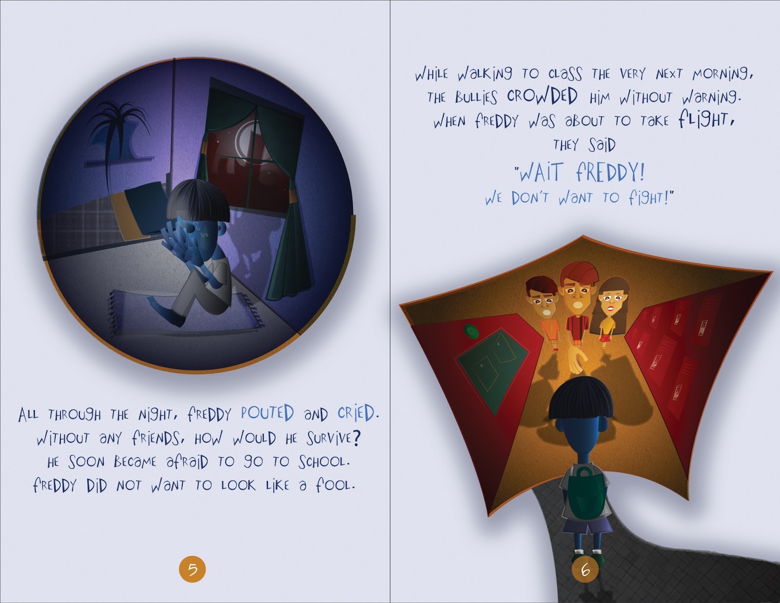
Cubism Issue - Freddy Fabby Goes to School
Saturday, 2 February 2013
New Yorker Music Issue - Mary J. Blige
Assignment 01 - Expressionism (02-04)
Thumbnails
Concept #1
Exaggeration / distortion, shadows (purple), halo effect, blues to reds/orange (ascension - salvation), eyes closed (somber effect), scar (pain)
Style Technique: Pastel painting with water colors
Reference Artist: Phillip Burke

Concept #2
"Talk to the hand" body position, hand in foreground, eye can be seen between fingers, eye (speaks the "truth", genuine), rough cuts to depict grittiness, black and white (like Shigley's Tracy Chapman)
Style Technique: Wood cutting
Reference Artists: Neil Shigley, Emil Nolde, Kaethe Kollwitz


Final Illustration
Full Page Spread - "The New Yorker"
Thumbnails
Concept #1
Exaggeration / distortion, shadows (purple), halo effect, blues to reds/orange (ascension - salvation), eyes closed (somber effect), scar (pain)
Style Technique: Pastel painting with water colors
Reference Artist: Phillip Burke

Concept #2
"Talk to the hand" body position, hand in foreground, eye can be seen between fingers, eye (speaks the "truth", genuine), rough cuts to depict grittiness, black and white (like Shigley's Tracy Chapman)
Style Technique: Wood cutting
Reference Artists: Neil Shigley, Emil Nolde, Kaethe Kollwitz


Final Illustration
Full Page Spread - "The New Yorker"
Subscribe to:
Comments (Atom)


